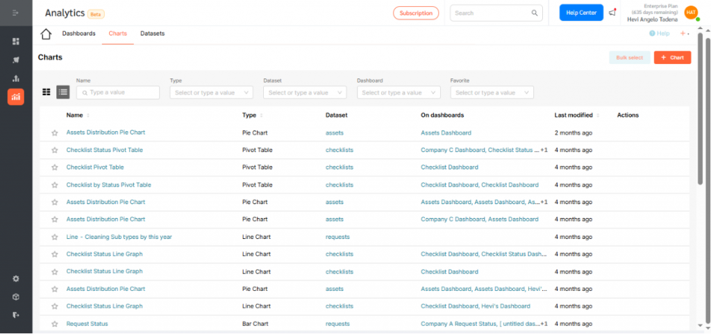
FacilityBot Analytics lets users create customizable visualizations and tables from datasets, similar to tools like PowerBI, but fully integrated within FacilityBot for seamless data analysis. Among its most effective tools is the Area Chart, which highlights trends and cumulative totals by filling the space beneath a line with color. This makes it ideal for tracking workloads, energy usage, or maintenance tasks, giving facility managers a clear view of both trends and overall impact.
Configuring an Area Chart
To create an Area Chart in Analytics:
- Log in to the FacilityBot Manager Portal.
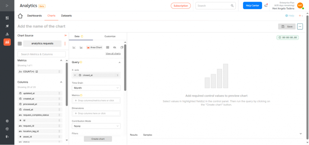
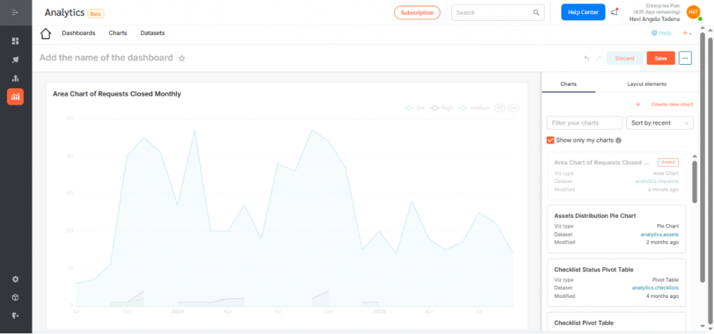
- Navigate to Analytics > Charts, then click the +Chart icon. For this walkthrough, we’ll create an Area Chart that shows the cumulative number of maintenance requests closed each month.
- Choose the dataset for your chart. For this example, select Requests.
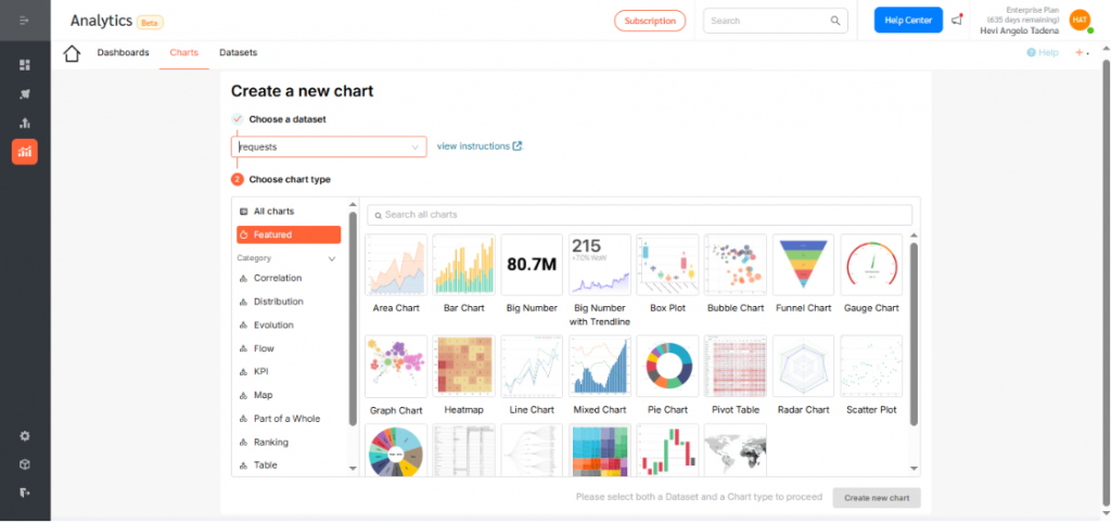
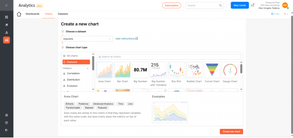
- Click the Area Chart icon. Then, click Create new chart to proceed.
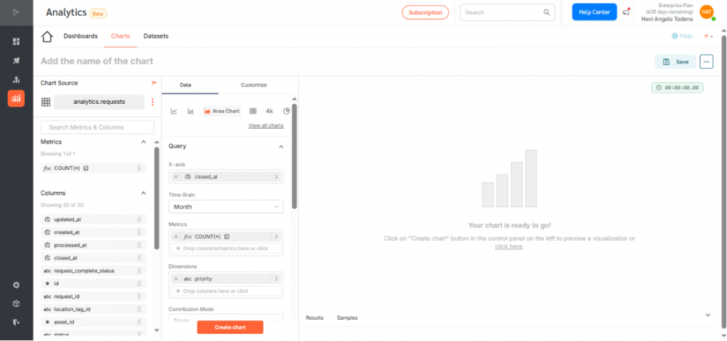
- Under the X-axis section, select the dimension you want to visualize. In this case, choose closed_at, which segments requests by the time they were created. Click Save to confirm your selection.
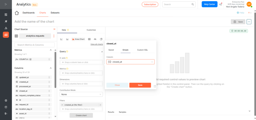
- Adjust the time grain (daily, weekly, monthly, quarterly, or yearly) depending on how you want the data displayed. For this example, select Monthly.
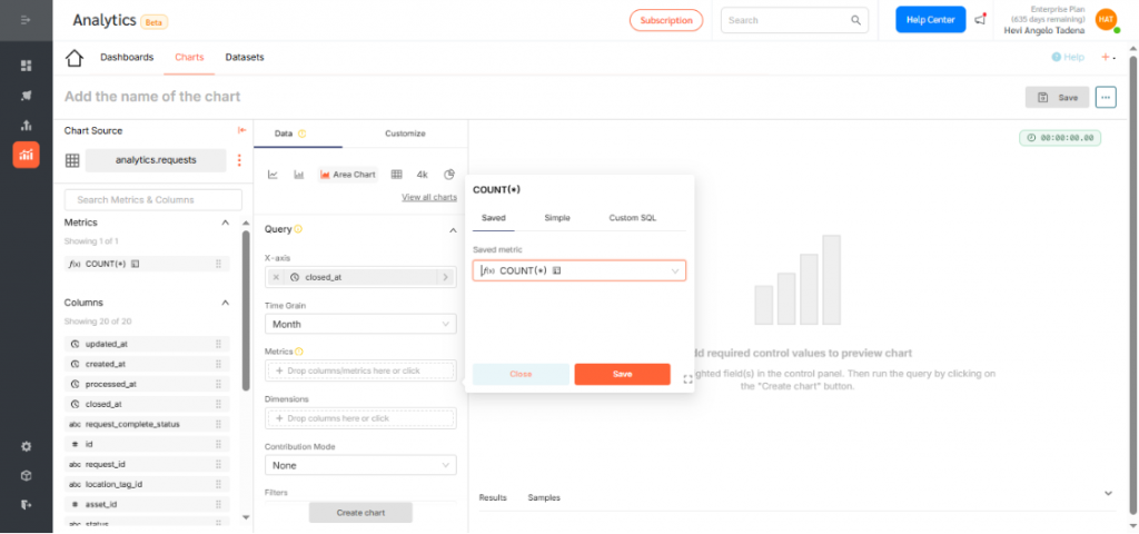
- Choose a metric to display. In this example, use the count function to show the number of requests created. Click Save.
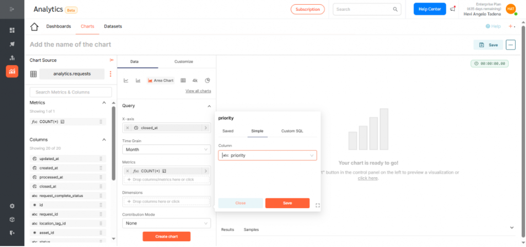
- Optionally, add dimensions to categorize or segment your data. Dimensions can include values like request type, location, or priority. For example, group requests by priority (High, Medium, Low) to see workload distribution.
- Click Create Chart to generate a preview.
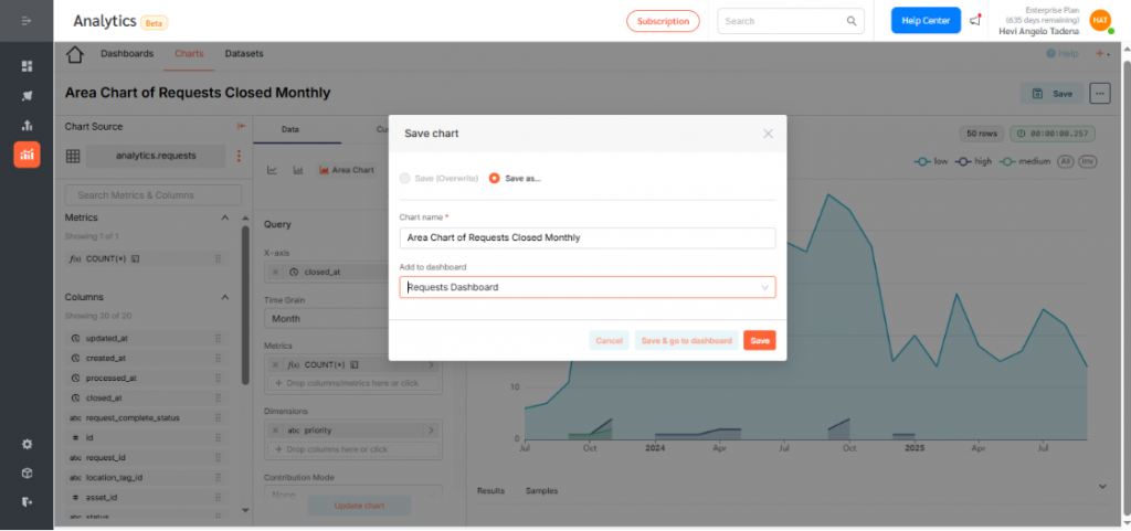
- If everything looks correct, click Save.
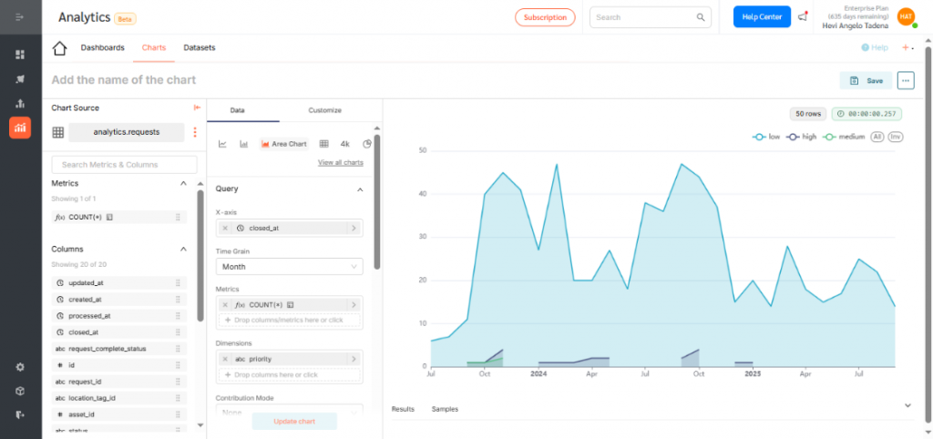
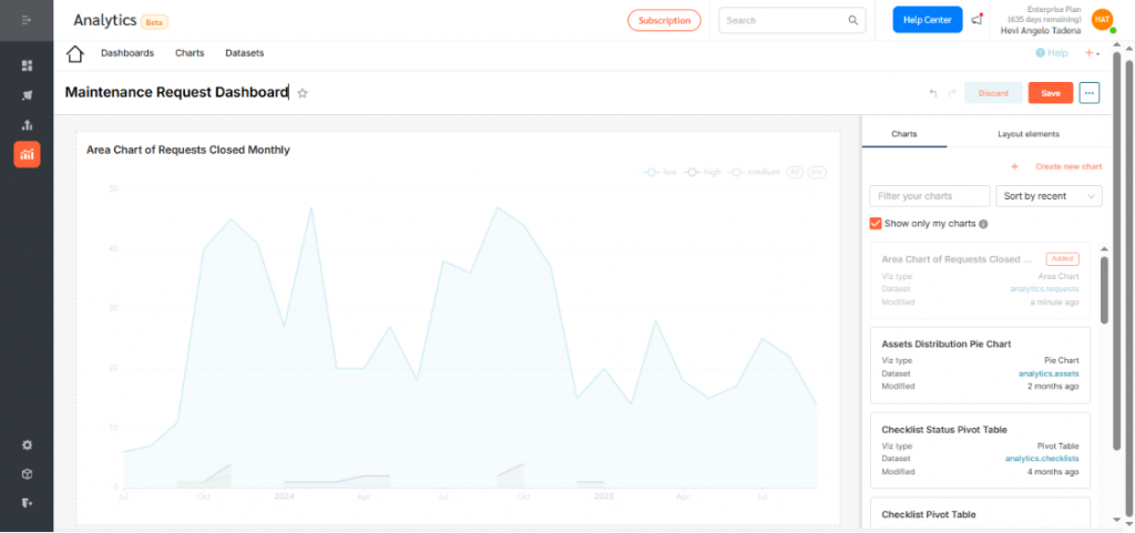
By selecting the correct fields, you’ve now successfully created an Area Chart that displays the cumulative number of requests closed per month, segmented by priority.
- Give your chart a descriptive name. Assign it to a dashboard for visibility and access. Click Save.
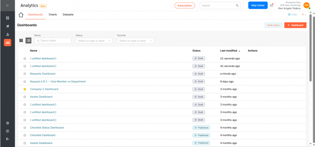
Displaying the Area Chart on a Dashboard
To add your chart to a dashboard:
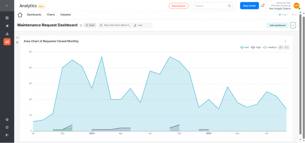
- Go to Dashboards and click +Dashboard.
- Drag your desired chart into the layout.
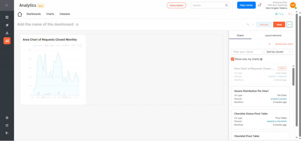
- Resize or reposition as needed.
- Rename the dashboard to reflect its purpose and click Save.
- By default, dashboards are saved as drafts. Click the Draft icon to publish.
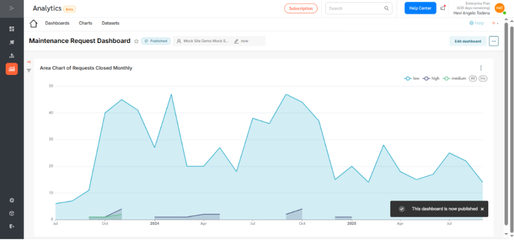
Area Charts in FacilityBot Analytics help facility managers visualize trends and volume, making it easy to track requests, usage, and workload distribution. They provide clear insights for proactive, data-driven decisions within the FacilityBot ecosystem.