Analytics in FacilityBot allows users to create insightful visualizations and tables from underlying datasets using a wide selection of chart types. Users can configure these charts and tables to appear on personalized dashboards for quick access to key metrics. This feature functions similarly to business intelligence tools like PowerBI but is seamlessly embedded within FacilityBot, offering facility managers integrated data analysis capabilities without the need for external software.
One of the most commonly used and effective visualizations in Analytics is the Bar Chart. It is a powerful visualization used to compare values across categories or over time. It helps highlight trends, patterns, and differences in data at a glance, making it a popular choice within FacilityBot’s Analytics feature.
Configuring a Bar Chart
To create a Bar Chart in Analytics:
- Log in to the FacilityBot Manager Portal.
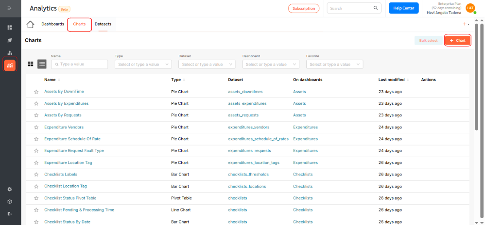
- Navigate to Analytics > Charts, then click the +Chart icon.
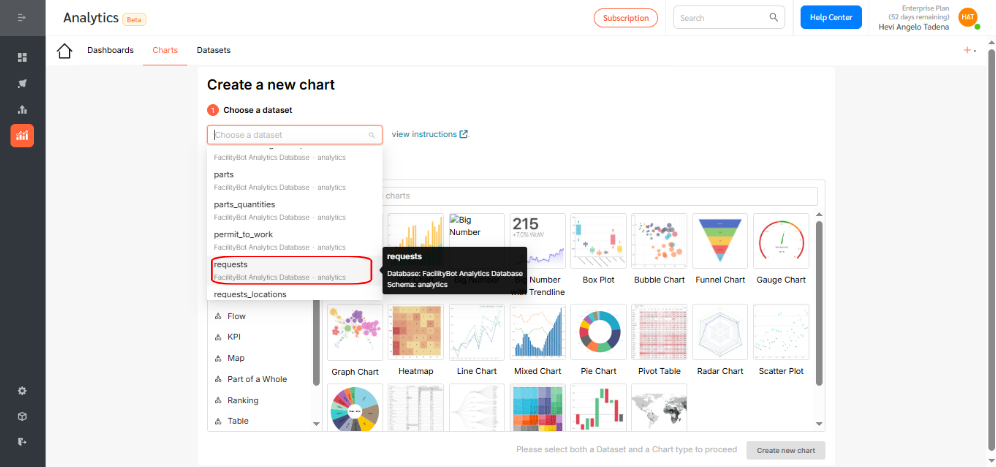
- For this walkthrough, we’ll create a bar chart that shows the distribution of requests created for each hour of the day.
- Choose the dataset for your chart. For this example, select Requests.
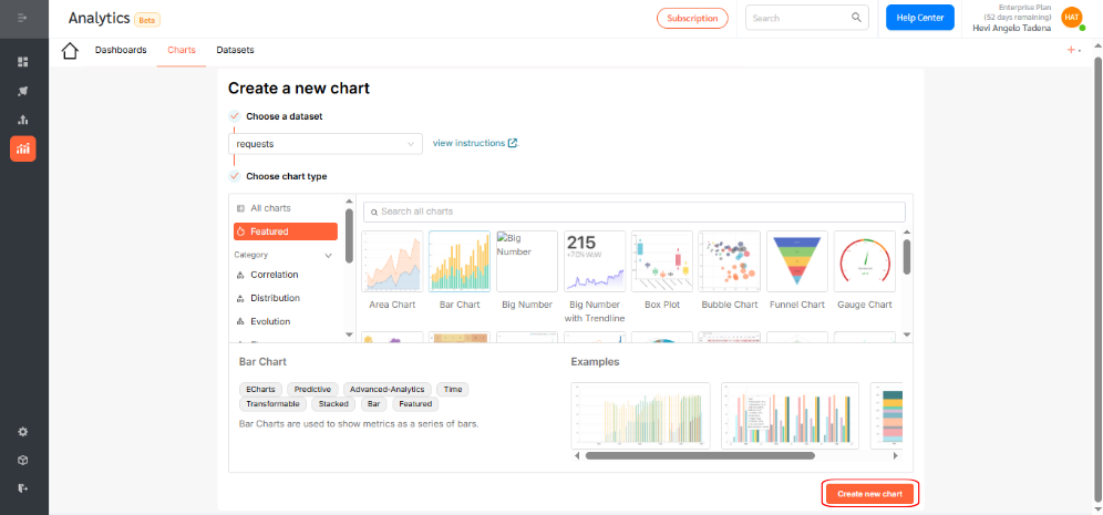
- Click the Bar Chart icon.
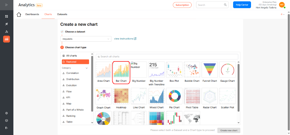
- Then, click Create new chart to proceed.
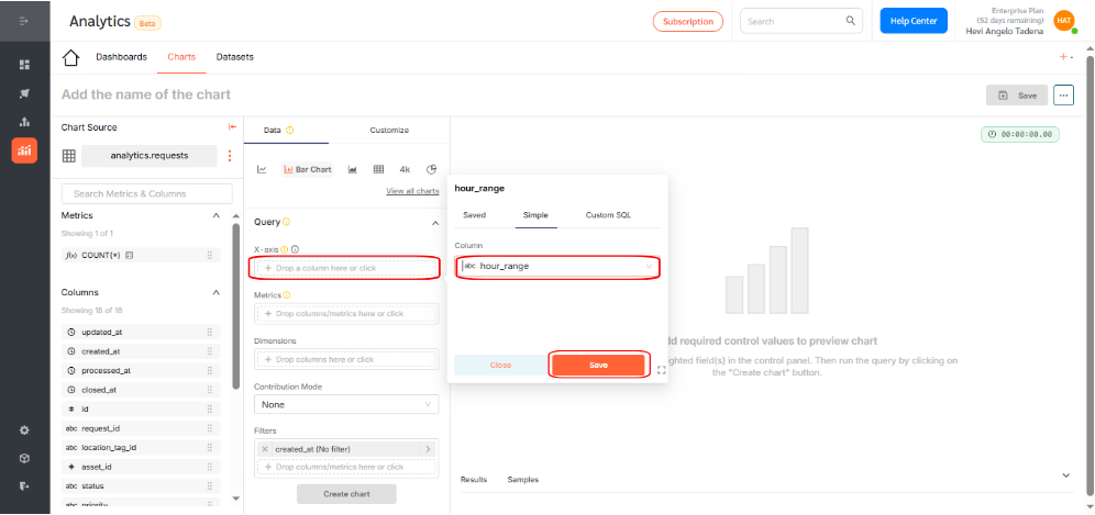
- Under the X-axis section, select the dimension you want to visualize. In this case, choose hour_range, which segments requests based on the hour they were created. Click Save to confirm your selection.
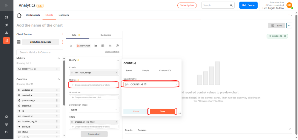
- Choose a metric to display by either: Applying an aggregation function (e.g., count, sum, average), or writing custom SQL for advanced use cases. For this example, use the count function to show the number of requests. Click Save.
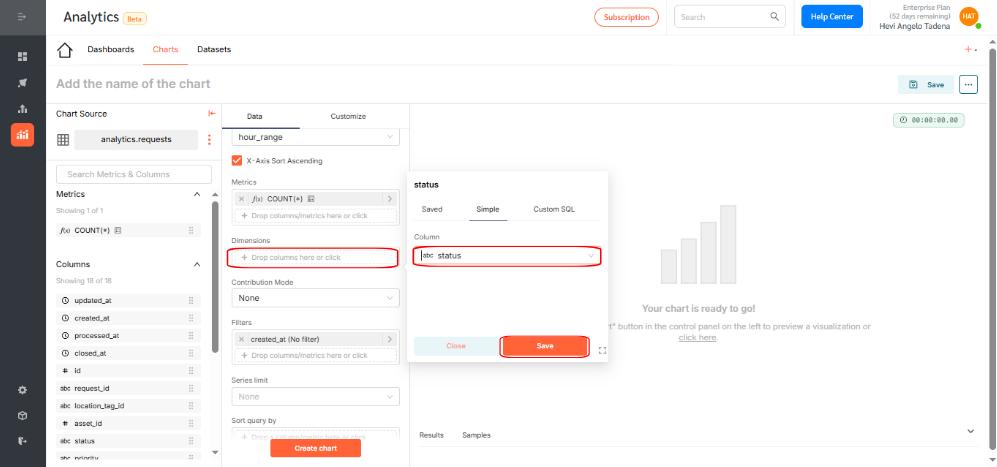
- If needed, select additional dimensions to group your data. You can use dimensions to categorize, segment, and reveal the details in your data. This will affect the level of detail in the view. Dimensions include qualitative values like priority, fault type, or statuses.In this example, add the status dimension to group requests as Pending, In Process, Canceled, or Completed. Click Save.
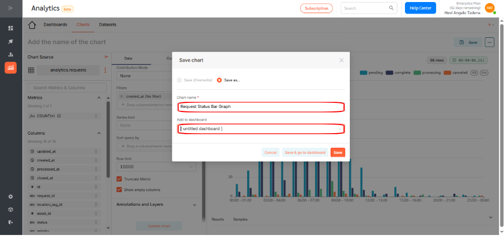
- Click Create Chart to generate a preview. If everything looks correct, click Save.
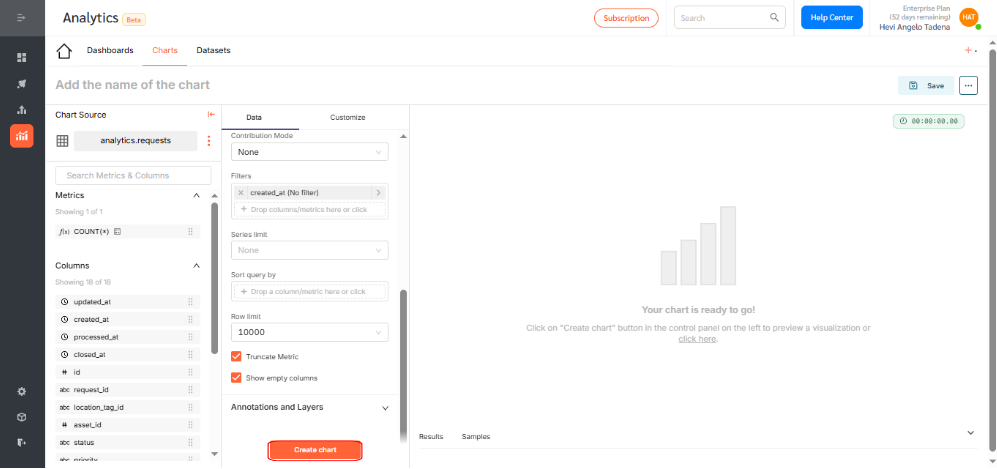
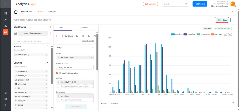
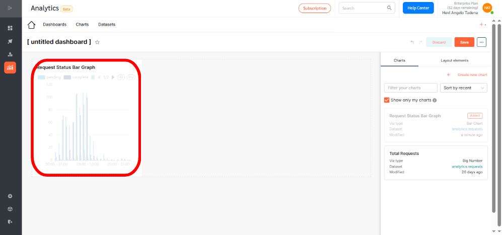
- By selecting the correct fields, you’ve now successfully created a bar chart that displays the number of requests submitted per hour, grouped by their status.
- Give your chart a descriptive name. Assign it to a dashboard for visibility and access.
Displaying the Bar Chart on a Dashboard
To add your chart to a dashboard:
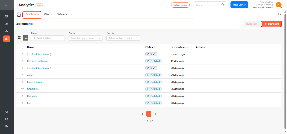
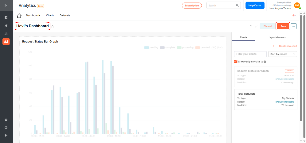
- Go to Dashboards and click +Dashboard.
- Drag your desired chart into the layout.
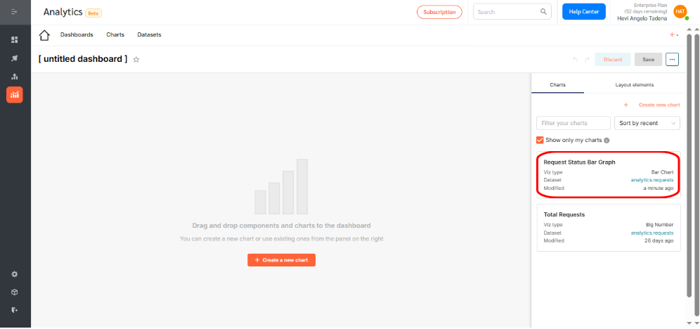
- Resize or reposition as needed.
- Rename the dashboard to reflect its purpose and click Save.
- By default, dashboards are saved as drafts. Click the Draft icon to publish.

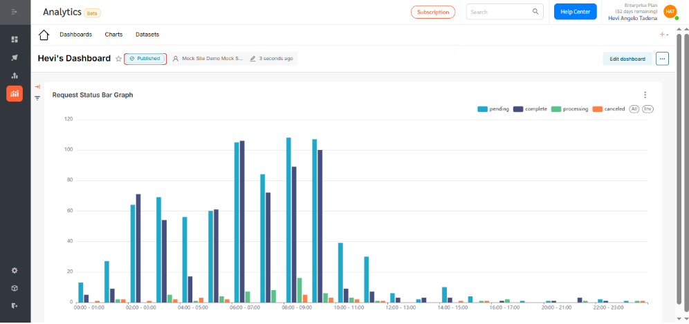
Bar Charts in FacilityBot Analytics provide a powerful way to visualize trends, monitor service performance, and drive data-informed decisions. Use them to uncover patterns and make operations more efficient.