Analytics in FacilityBot allows users to create insightful visualizations and tables from underlying datasets using a wide selection of chart types. Users can configure these charts and tables to appear on personalized dashboards for quick access to key metrics. This feature functions similarly to business intelligence tools like PowerBI but is seamlessly embedded within FacilityBot, offering facility managers integrated data analysis capabilities without the need for external software.
One of the most widely used and intuitive visualization tools in Analytics is the Pie Chart. Ideal for illustrating proportions and distributions within a dataset, the Pie Chart displays data as slices of a circular graph, making it easy to compare parts of a whole at a glance. This visualization is especially useful for facility managers who need to assess the relative contribution of categories such as issue types, task sources, asset conditions, or department performance. By clearly showing how each segment contributes to the total, the Pie Chart enables fast, visual decision-making in managing facility operations.
Configuring a Pie Chart
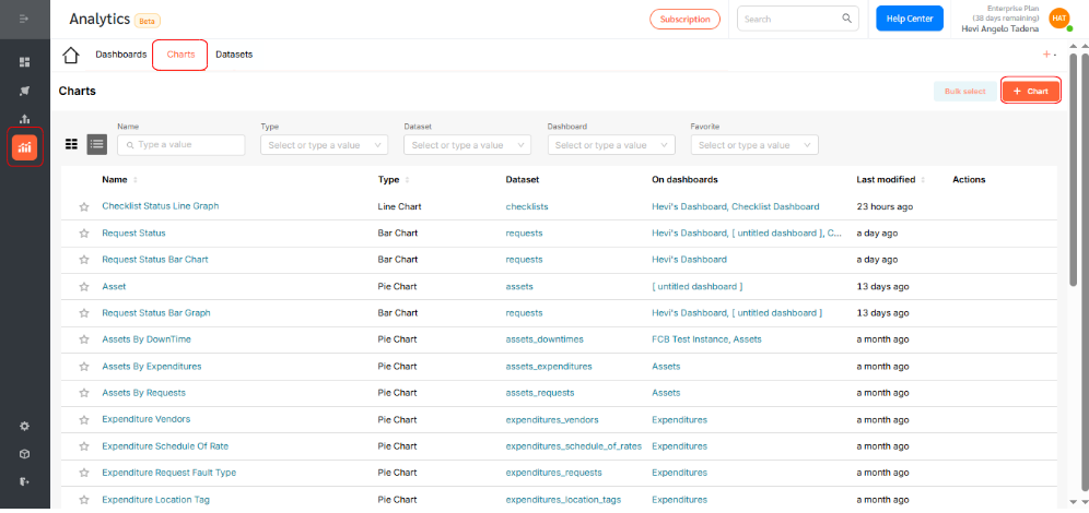
To create a Pie Chart in Analytics:
- Log in to the FacilityBot Manager Portal.
- Navigate to Analytics > Charts, then click the +Chart icon.
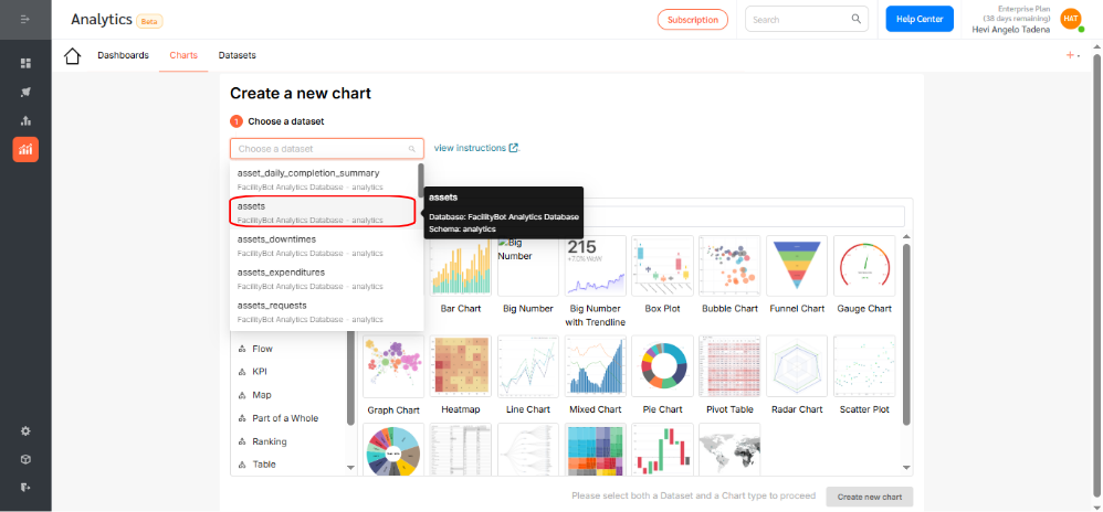
- In this walkthrough, we’ll create a pie chart that illustrates the distribution of assets across all locations, providing a clear visual breakdown of where assets are situated.
- Choose the dataset for your chart. For this example, select Assets.
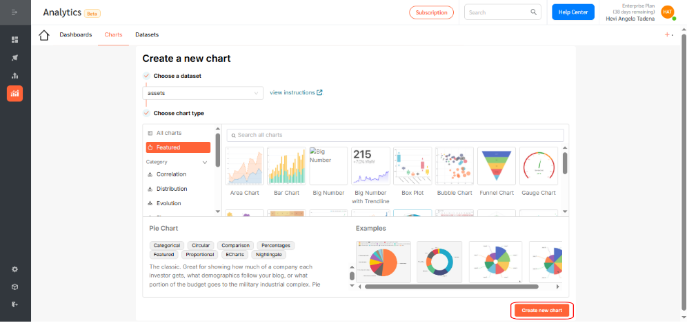
- Click the Pie Chart icon.
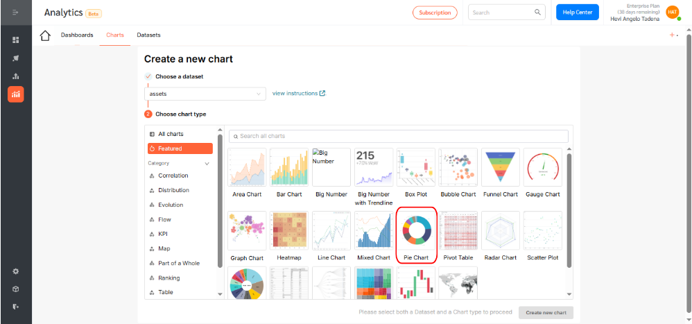
- Then, click Create new chart to proceed.
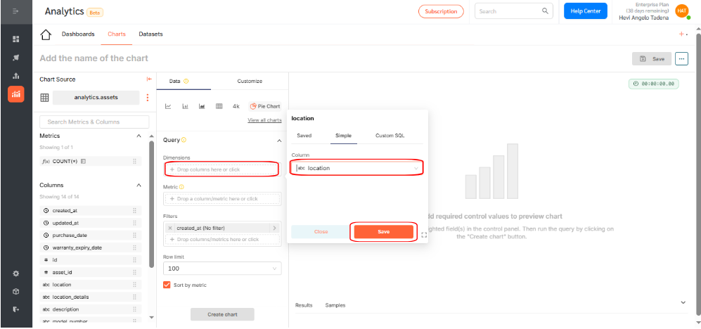
- Choose a dimension to be displayed in the pie chart. A dimension is a categorical variable used to organize, group, or filter data to provide meaningful context. Common examples of dimensions include location, asset type, service request category, and user role. For this pie chart, choose location as the dimension to display. This selection will show the distribution of assets across various locations, with each slice of the pie representing a different location and its corresponding share of the total assets. Once selected, click Save to confirm your selection.
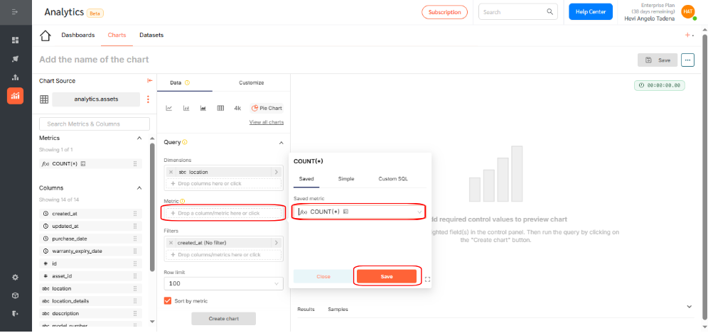
- Choose a metric to display by either: Applying an aggregation function (e.g., count, sum, average), or writing custom SQL for advanced use cases. For this example, use the count function to show the number of checklists. Click Save.
- Click Create Chart to generate a preview. If everything looks correct, click Save.
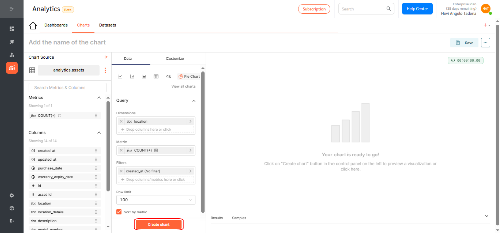
- By selecting the appropriate fields, you have successfully generated a pie chart that visually represents the number of assets distributed across each location.

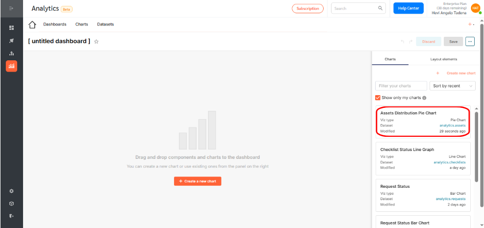
- Give your chart a descriptive name. Assign it to a dashboard for visibility and access.

Displaying the Pie Chart on a Dashboard
To add your chart to a dashboard:
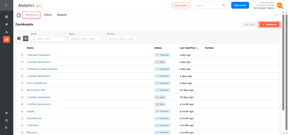
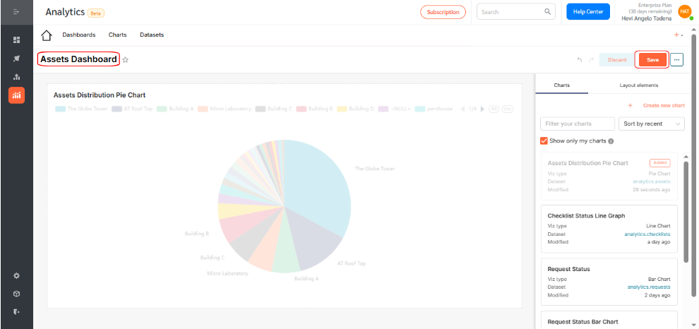
- Go to Dashboards and click +Dashboard.
- Drag your desired chart into the layout.
- Resize or reposition as needed.

- Rename the dashboard to reflect its purpose and click Save.
- By default, dashboards are saved as drafts. Click the Draft icon to publish.
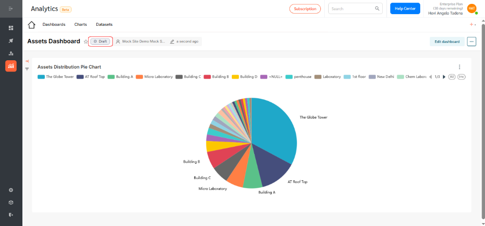

Pie Charts in FacilityBot Analytics provide a clear and impactful way to visualize data distribution and understand proportional relationships at a glance. Use them to highlight category breakdowns, compare service request types, and identify resource allocation—all seamlessly integrated within the FacilityBot ecosystem.