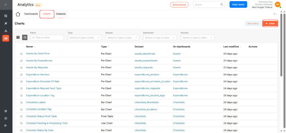
Analytics in FacilityBot allows users to create insightful visualizations and tables from underlying datasets using a wide selection of chart types. Users can configure these charts and tables to appear on personalized dashboards for quick access to key metrics. This feature functions similarly to business intelligence tools like PowerBI but is seamlessly embedded within FacilityBot, offering facility managers integrated data analysis capabilities without the need for external software.
One of the most popular and insightful visualization tools in Analytics is the Line Chart. Ideal for tracking trends and variations over time, the Line Chart connects data points using continuous lines, making it easy to observe fluctuations, seasonal patterns, and long-term progress. This makes it particularly valuable for facility managers monitoring time-based metrics, such as task volumes, completion rates, or issue trends.
Configuring a Line Chart
To create a Line Chart in Analytics:
- Log in to the FacilityBot Manager Portal.
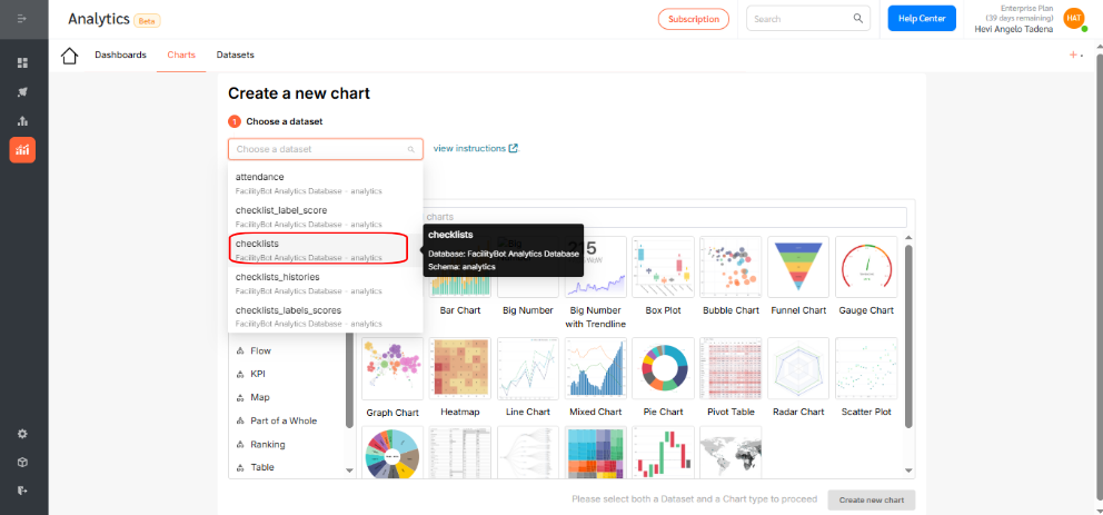
- Navigate to Analytics > Charts, then click the +Chart icon.
- For this walkthrough, we’ll create a Line chart that shows the distribution of checklists created for every month.
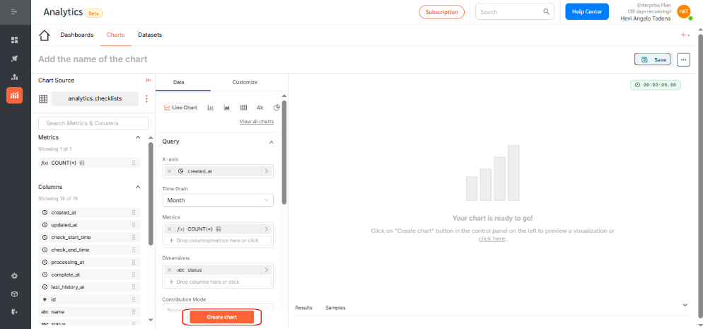
- Choose the dataset for your chart. For this example, select Checklist.
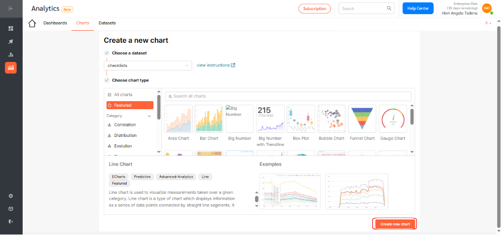
- Click the Line Chart icon.
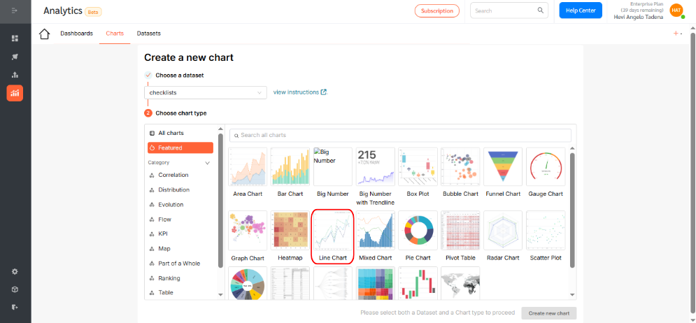
- Then, click Create new chart to proceed.
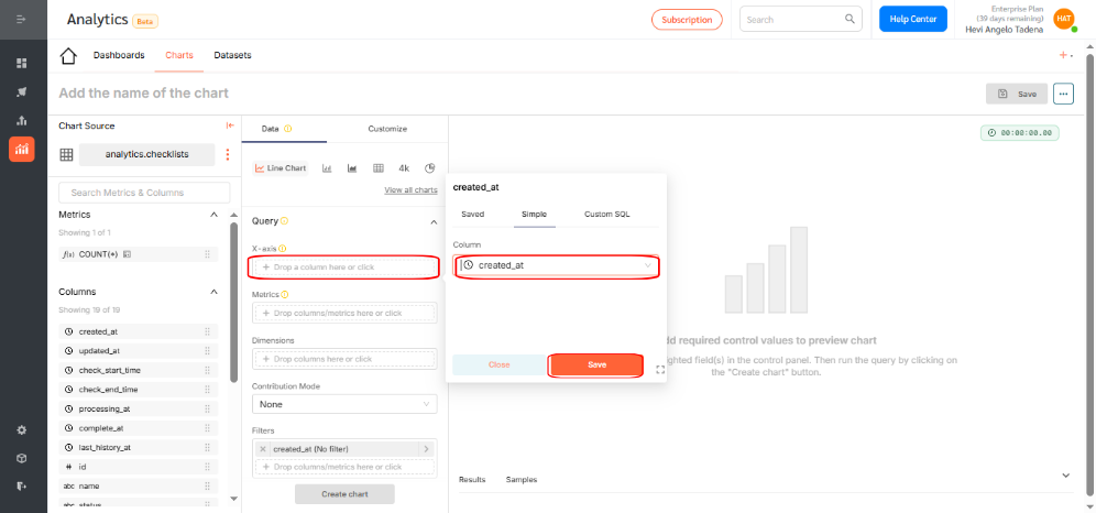
- Under the X-axis section, select the dimension you want to visualize. In this case, choose created_at, which segments checklists based on the time they were created. Click Save to confirm your selection.
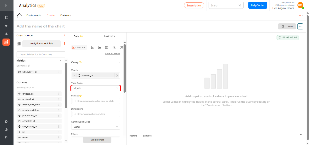
- Optionally, adjust the time grain to daily, weekly, monthly, quarterly, or yearly.
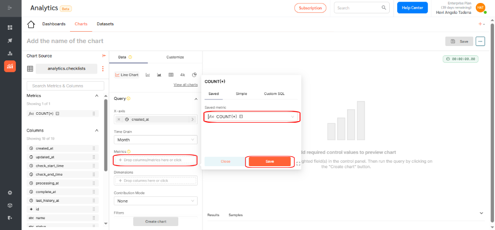
- Choose a metric to display by either: Applying an aggregation function (e.g., count, sum, average), or writing custom SQL for advanced use cases. For this example, use the count function to show the number of checklists. Click Save.
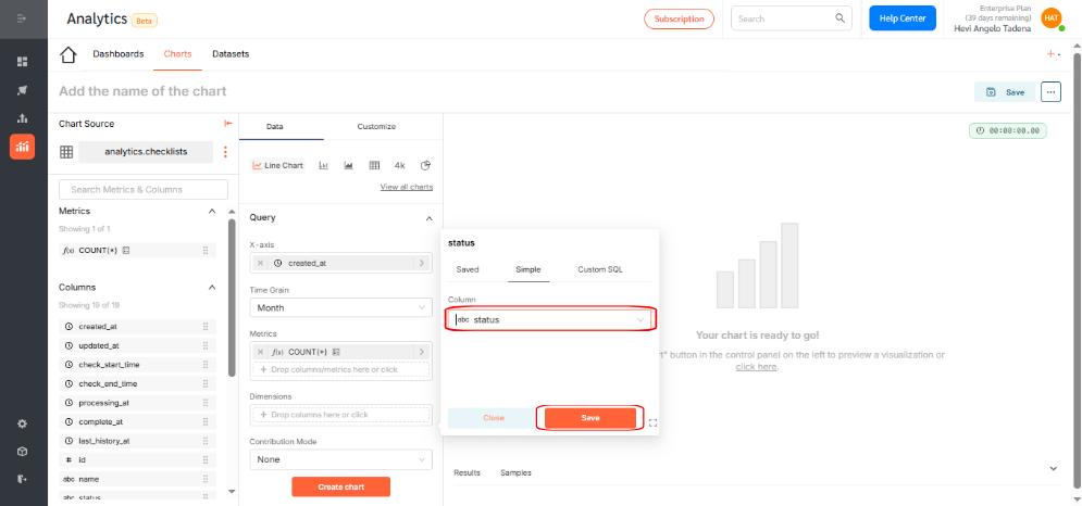
- If needed, select additional dimensions to group your data. You can use dimensions to categorize, segment, and reveal the details in your data. This will affect the level of detail in the view. Dimensions include qualitative values like priority, fault type, or statuses. In this example, add the status dimension to group checklists as Pending, In Process, Canceled, or Completed. Click Save.
- Click Create Chart to generate a preview. If everything looks correct, click Save.
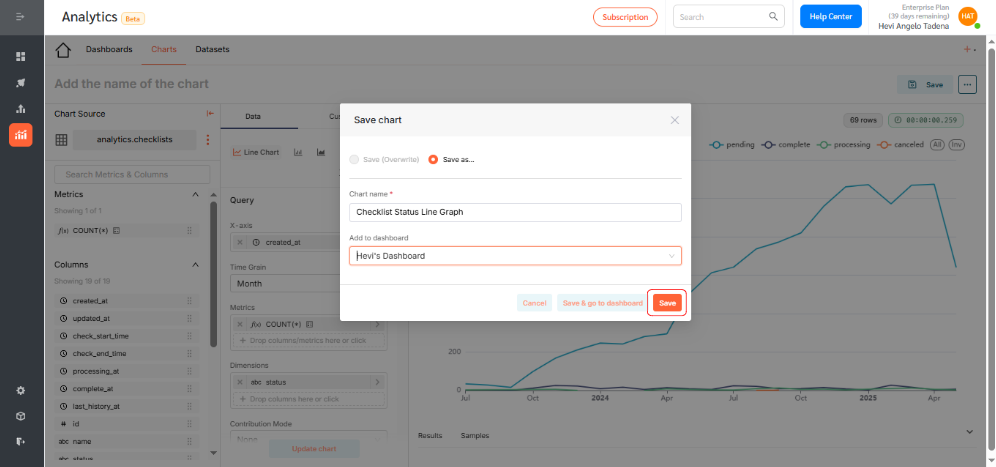
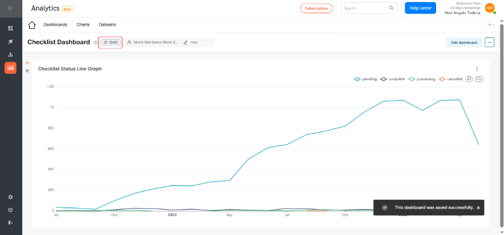
- By selecting the correct fields, you’ve now successfully created a line chart that displays the number of checklists submitted per month, grouped by their status.

- Give your chart a descriptive name. Assign it to a dashboard for visibility and access. Click Save.
Displaying the Line Chart on a Dashboard
To add your chart to a dashboard:
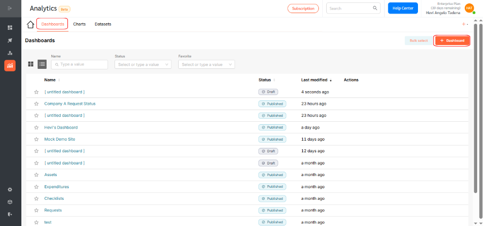
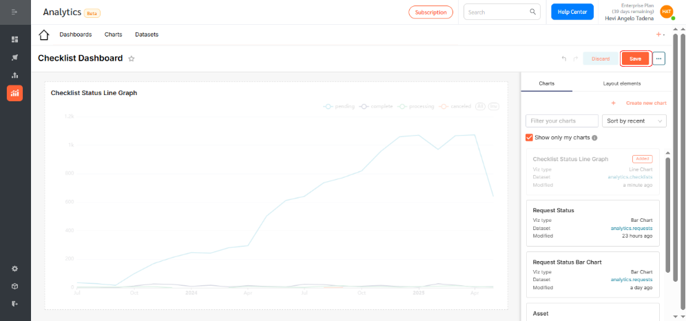
- Go to Dashboards and click +Dashboard.
- Drag your desired chart into the layout.
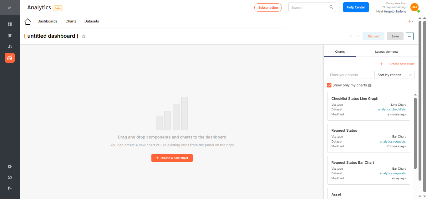
- Resize or reposition as needed.
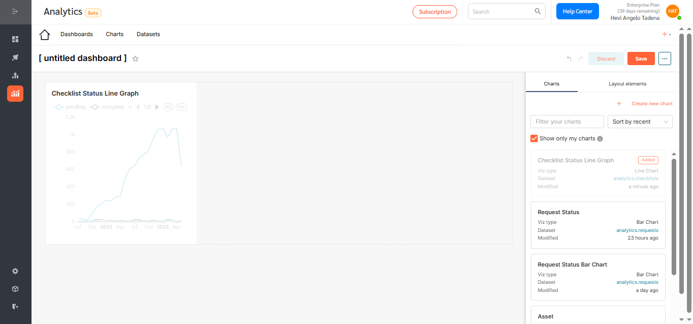
- Rename the dashboard to reflect its purpose and click Save.
- By default, dashboards are saved as drafts. Click the Draft icon to publish.
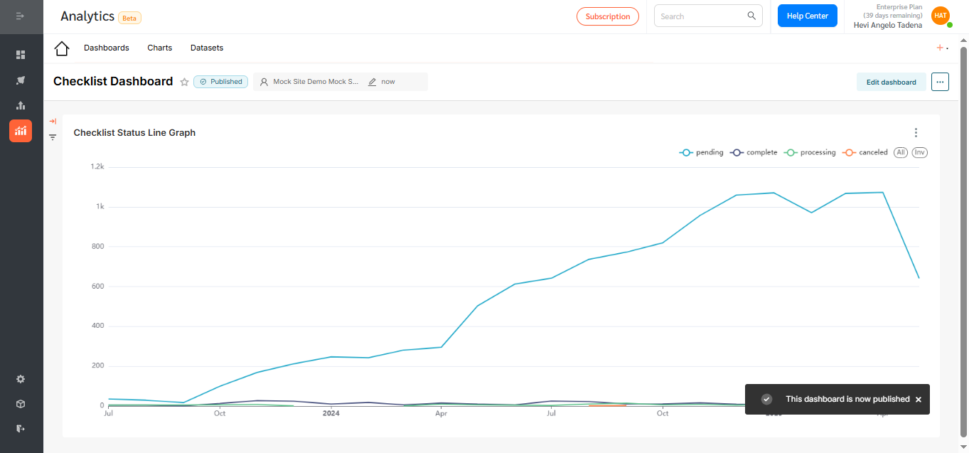
Line Charts in FacilityBot Analytics offer a powerful, intuitive way to track trends, visualize performance, and make data-driven decisions. Use them to uncover operational patterns, monitor service delivery over time, and continuously improve facility management outcomes—all within the FacilityBot ecosystem.