FacilityBot’s Heat Map helps facility managers quickly identify trends in activity across different times and locations. By using colors to represent data intensity, Heat Maps make it easy to see when and where issues are happening most often,it highlights which areas have the highest concentration of equipment and where potential issues may arise —allowing teams to plan smarter and respond faster.
This is especially useful in facilities management for tracking maintenance request patterns, cleaning needs, asset load or equipment issues across time or zones.
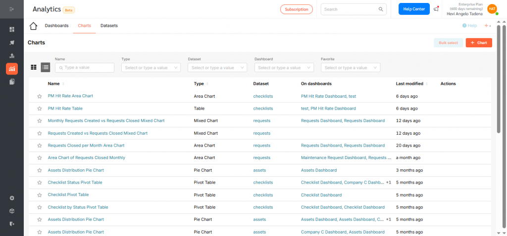
Creating a Heat Map
To create a Heat Map in Analytics:
- Log in to the FacilityBot Manager Portal.
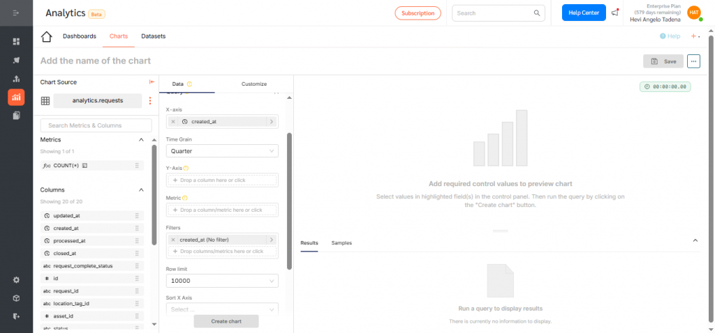
- Navigate to Analytics → Charts, then click the + Chart icon.
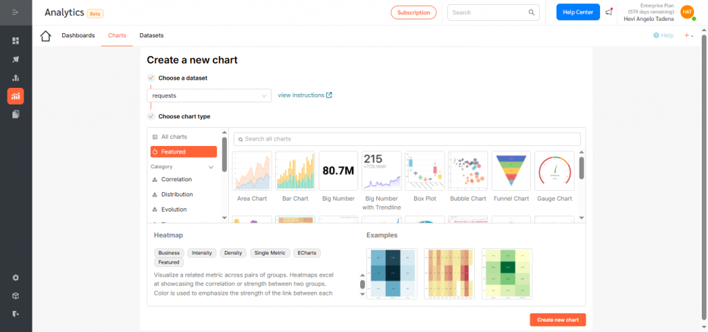
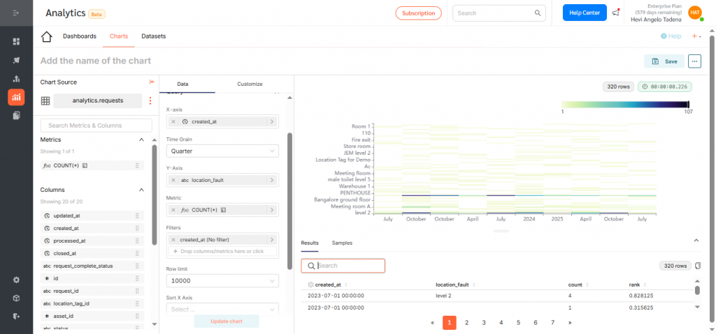
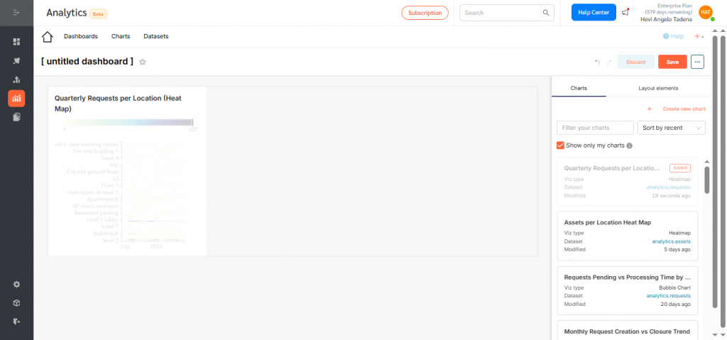
In this example, we’ll create a Heat Map that shows the number of requests created per location each quarter.
- Choose your dataset. For this Heat Map, select Requests.
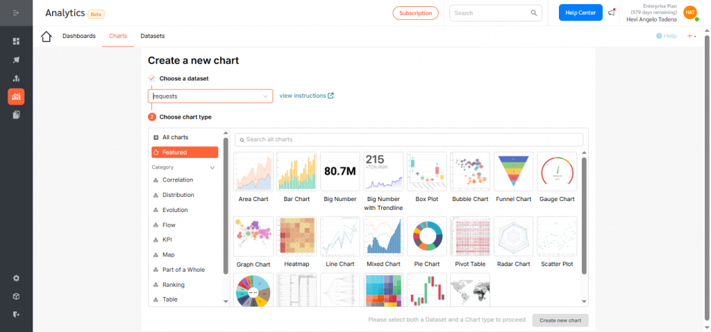
- Click the Heat Map icon, then choose Create new chart.
- Under X-Axis, select created_at, then change the time grain to Quarter so the chart displays quarterly trends. Click Save.
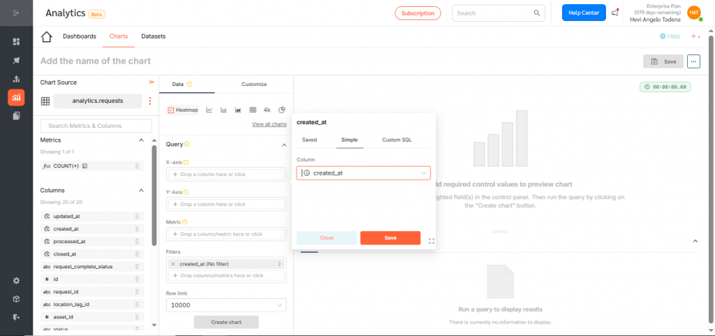
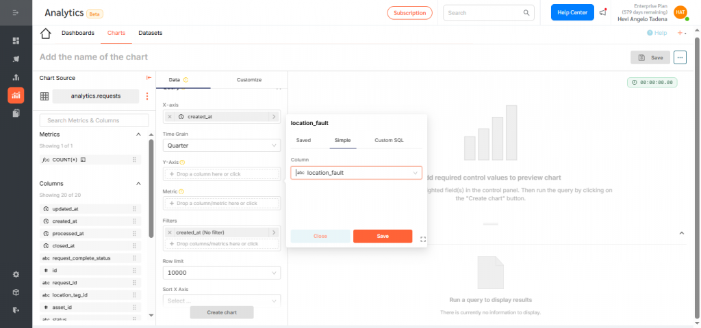
- Under Y-Axis, select location_fault. Click Save.
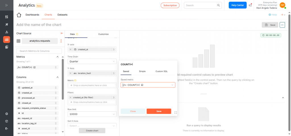
- Under Metric, choose count to display the number of assets versus location. Click Save.
- Click Create Chart to preview your configuration.
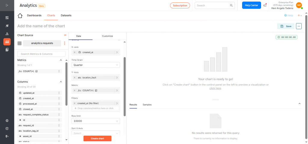
- If everything looks correct, click Save.
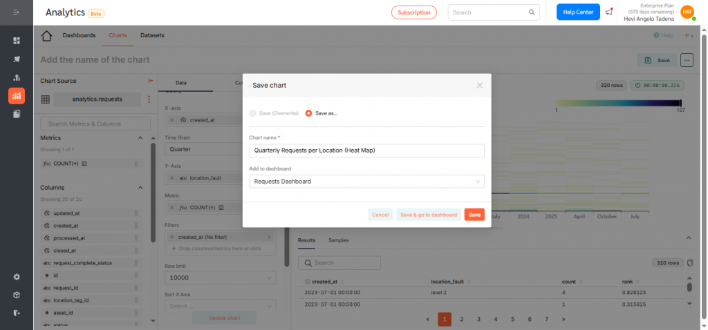
- Give the chart a clear, descriptive title such as “Quarterly Requests per Location (Heat Map)”, and assign it to a dashboard. Click Save to finalize.
Displaying the Heat Map on a Dashboard
To add your Heat Map to a dashboard:
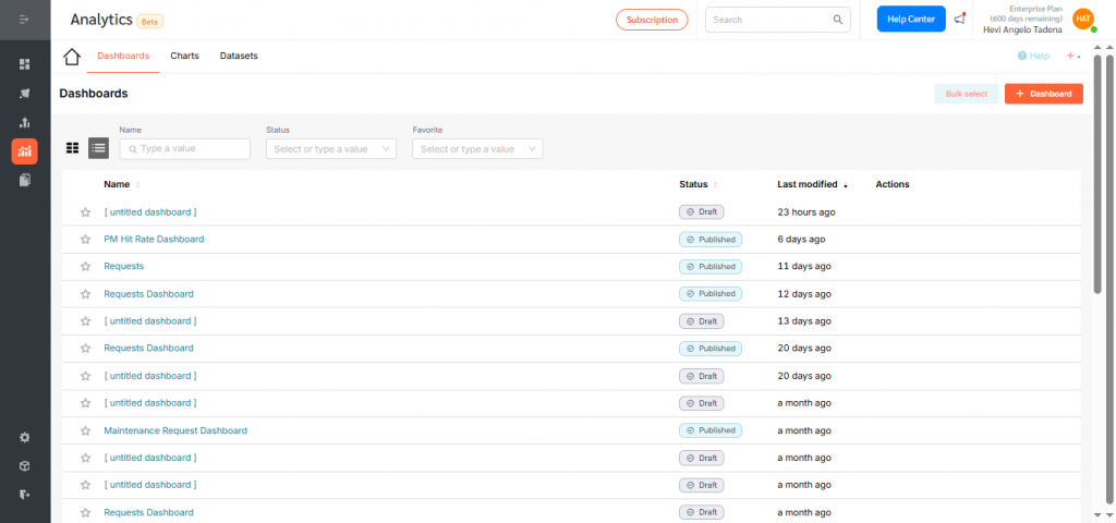
- Go to Dashboards, then click +Dashboard.
- Drag your newly created Heat Map into the layout.
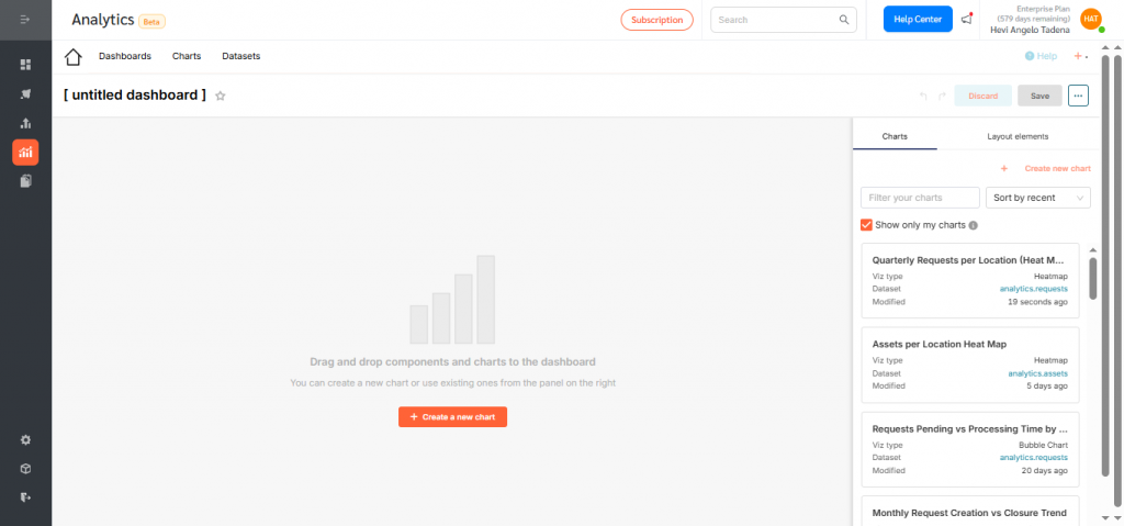
- Resize or reposition as needed for clarity and balance.

- Rename the dashboard and click Save.
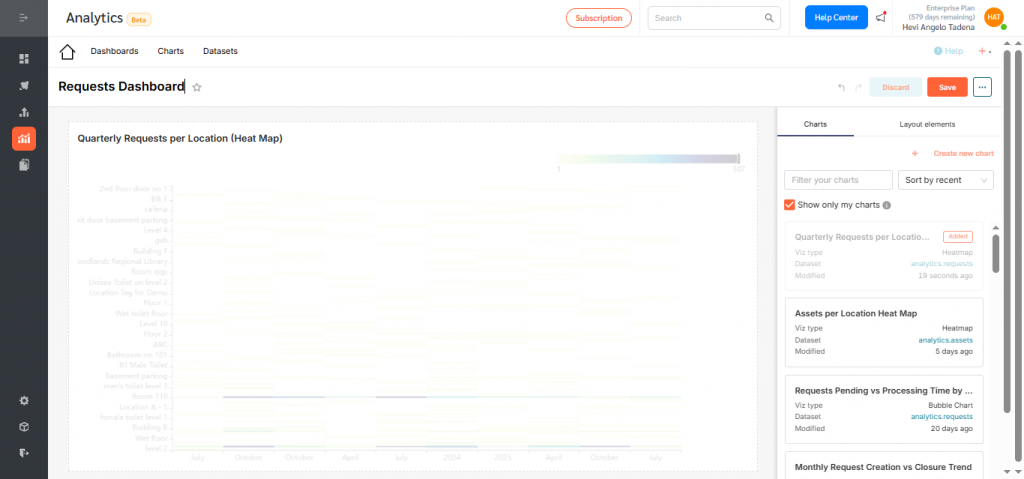
- By default, dashboards are saved as drafts. Click the Draft icon to publish.
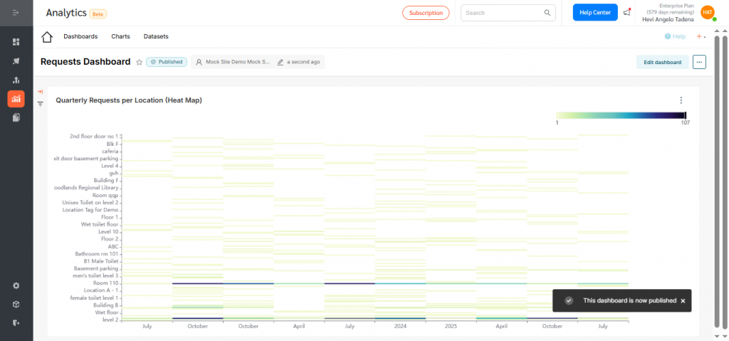
Heat Maps in FacilityBot Analytics give teams a clear, color-coded view of how request activity shifts across locations over time. By surfacing hotspots where request volume is highest each quarter, they make it easy to spot emerging trends, seasonal patterns, and areas needing additional attention.
By transforming complex request data into intuitive visual patterns, these Heat Maps help facility managers prioritize workload, allocate resources more effectively, and make faster, data-driven decisions to keep operations running smoothly.